CREATING AN IMPRESSIVE PORTFOLIO
Strong portfolio that provides a clear understanding of your skill and personal brand is one of the key steps in securing new clients.
Even though, at the moment, many clients are turning to online means of finding photographers, such as website and social media, portfolio remains a key point in communication as well as opportunity for them to see which work you yourself consider your key work, which in turn gives them idea about your taste and aesthetic.
It becomes crucial if you are reaching out to them by yourself and serves as their first introduction to you not just as an artist, but as a professional.
However, not everyone puts enough effort into developing a strong portfolio and many are still unaware of what to consider while doing it.
I have compiled a list of key elements comprising a strong portfolio, as well as answers to some frequently asked questions.
LAYOUT AND CONTENT -WHAT DOES PHOTOGRAPHER’S PORTFOLIO COMPRISE OF:
1. Introduction- short note about you
Do not add your CV, your education information or unrelated hobbies!
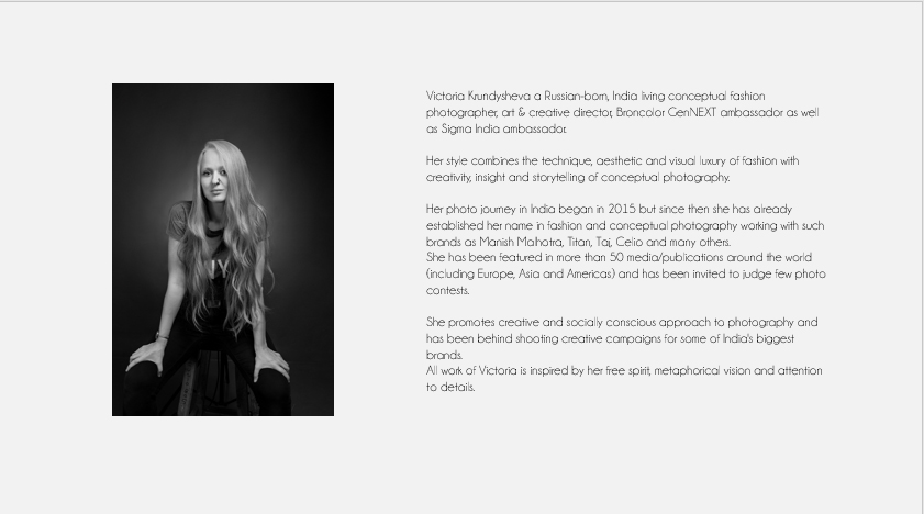
You need to have a few sentences about who you are and what is your key USP (what differentiates you from the rest)
Fine Art photographers can include their artist statement that is concise.
2. List of clients – you can add a list of your key clients and key projects, or simply client logos, since for many people logos is the fastest way to identify a brand
3. Images
- Number of images should range within 30-40, not more than that. Ideal number of images will be around 20. At the first glance, clients are unlikely to scroll through more than 10 pages of your portfolio, so ensure that best and MOST RELEVANT work is placed on first few pages
- How to decide which images to include.
The key to imagery that you include in your portfolio is your targeting.
Who is your audience and target clients.
If you are sending portfolio to fashion house, the primary work in your portfolio should be fashion-related. Remaining work in closest categories in sections after that.
You can include additional imagery on 1 or 2 pages in the end of your portfolio under “ Other Work”, “Other Projects” or “Personal Projects”
Do not include random work in main sections.
You will only get the work that you display. So, compile your portfolio accordingly. If you want to get more portrait work – portrait images need to be the most prominent in your portfolio. If you want to shoot more commercial – place focus on commercial images.
- Text under images – unless you are a fine-art or conceptual photographer for whom the description can play an important role, stick to just the name of the client or project under your image. Do not add a lot of text to accompany each image.
Fine Art and Conceptual photographers can have a text to accompany their imagery if it plays an important role in their work.
4. Layout
- Cover – stick to clean covers, mentioning your name or logo as well as the word “Portfolio” in it
- Layout of your portfolio can be having minor elements of design, but it should not distract from the imagery. It only serves to highlight your aesthetic and support the images.
What I mean by that- if your aesthetic is edgy and colorful, you can use color in your porfolio design, but it needs to not take all the attention on itself.
If don’t know much about design- then stick to less is more. Stick to cleaner look and colors that are sophisticated and simple- white, grey or black.
Why does the color of your portfolio pages matter- it gives a touch of mood to your portfolio, shows your sense of taste and highlights your imagery.
For fashion photographers, advertisement and commercial I will recommend to stick to lighter colors- white and grey.
For Fine Art, Portrait and Landscape- black works very well. Black gives a more artistic touch to your portfolio, where as white and grey is associated with professionalism, corporate and luxury.
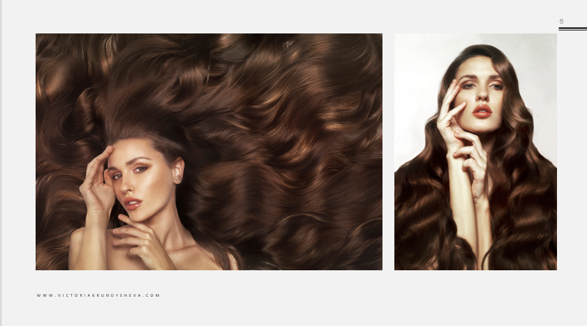
In terms of size and Layout direction – I will recommend landscape format. It is a more convenient one in terms of viewing.
Do not add watermark on your images!
Placement of images is important. When you include two images on your page it is important how well they correspond in terms of style.
Having two images with extremely different aesthetic right next to each other will look confused and will inevitably draw focus to one or the other only.
5. Customization
Keep an open file of your portfolio (I usually work with PPT that is later converted to PDF), so that you can rearrange the images depending on who you are pitching to.
HARD COPY VS SOFT COPY
Soft Copy of your portfolio is important while sending emails.
But Hard Copy is beneficial to have when attending personal meetings.
Why is hard copy important:
- Security and efficiency – laptops can get discharged, can take too long to switch on and load, which hinders the flow of your meeting
- It shows that you are putting additional effort
- It helps engage tactile senses, apart from visual. The benefit of being able to touch the portfolio, flip the pages adds to positive impression. It also allows your client to decide which images they want to focus on and view in details.
That said, quality of print here becomes extremely important. Not just the quality in terms of how the images look, but how the pages feel as well, what paper is used, what binding and cover.

Ideally, you want to be able to leave one printed portfolio with a client. If you can’t afford to print multiple copies of portfolio, then print at least one and keep carrying it for your meetings.
Size: A4 is the optimal size as it is convenient to carry and hold. However, if details are crucial in your imagery, A3 size will work as well.
WHAT IS AN INTRODUCTION BOARD AND MEDIA KIT
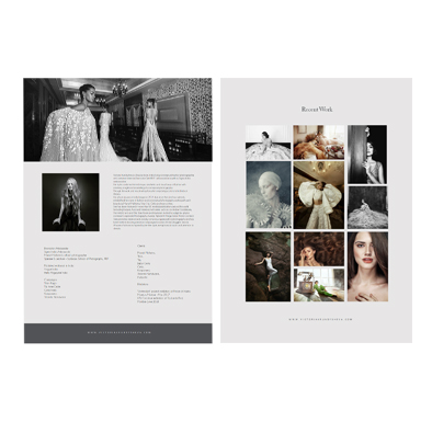
Introduction board is a short 1 or 2 pages document that gives key information about you and displays a compilation of your relevant work.
It is best used for initial email along with Media Kit as it provides brief idea, easy to view and convenient to send.
Media Kit is the document that includes any and all media features of you and your work, such as articles, interviews, work that was featured in posters/movies/TV etc.
Instead of adding these details to your portfolio – provide a separate media kit alongside the portfolio.

