Excess and editing down
Today I want to talk about a trap that many photographers, especially beginners tend to fall into- excess.
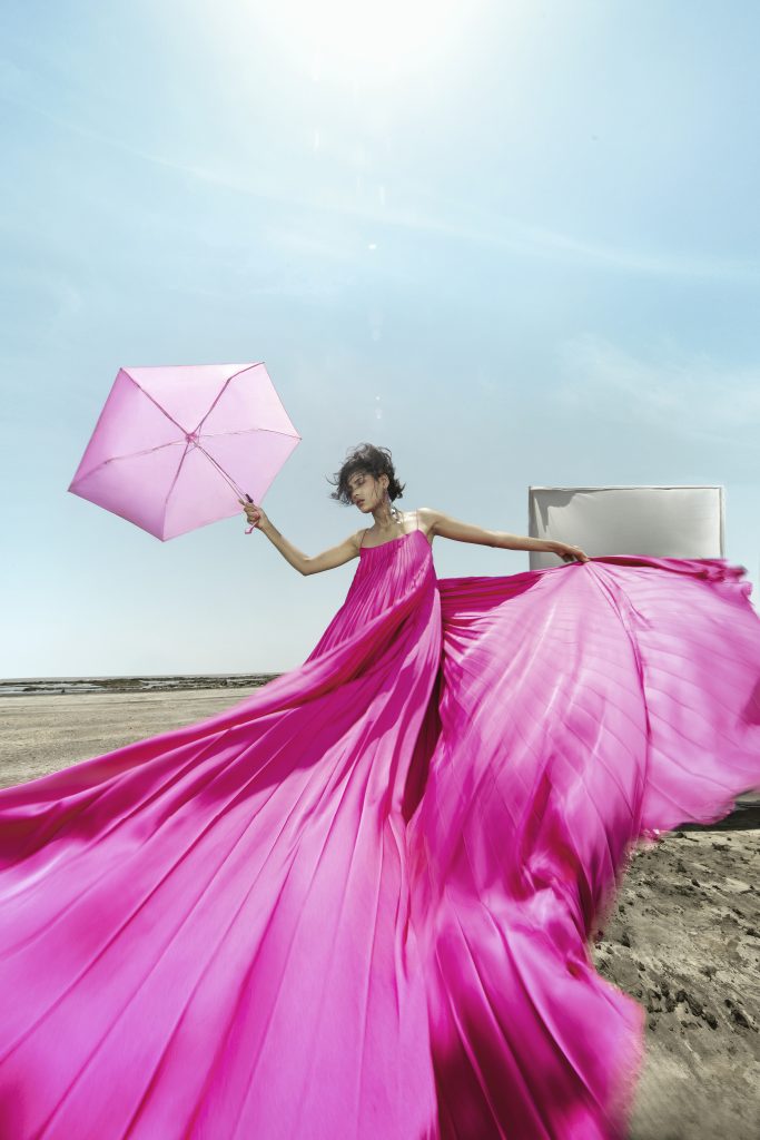
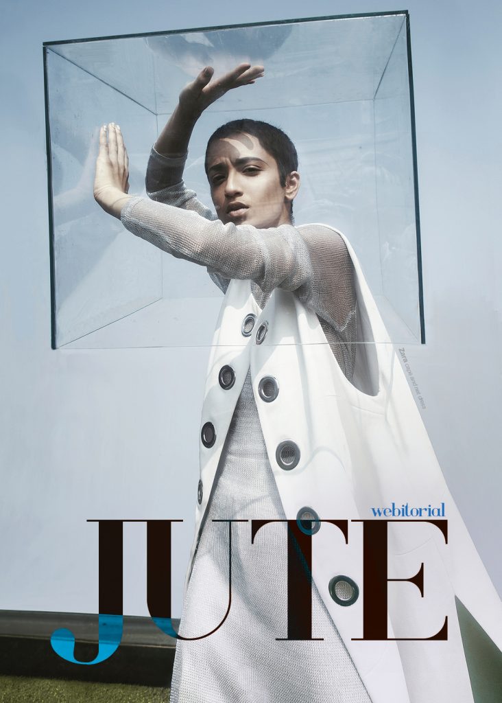
Having the urge to add many elements in your photograph, many props, a lot of make up and a lot of style elements is dangerous to the final output.
Combining multiple elements of the image in harmony is art. It is complicated and takes a lot of practice and understanding of aesthetics.
So many times I have come across the misconception of excess being “high fashion”. Which it is not.
Having a heavy make up or colors all over model’s face, also adding some flowers on her head, also adding tons of jewelry and then surrounding model with many props- something that many attempt, but very few successfully balance.
Do not confuse exaggeration and excess. Exaggeration focuses on emphasizing one part of the frame primarily. Excess in a simple terms is “too much”, “more than necessary”.
And it’s a trap many fall into. There is nothing wrong with expressing yourself in whichever style you wish.
But the main issue with excess is- it can majorly distract from idea, from subject. It can dilute your frame, turning it into a “hot mess”.
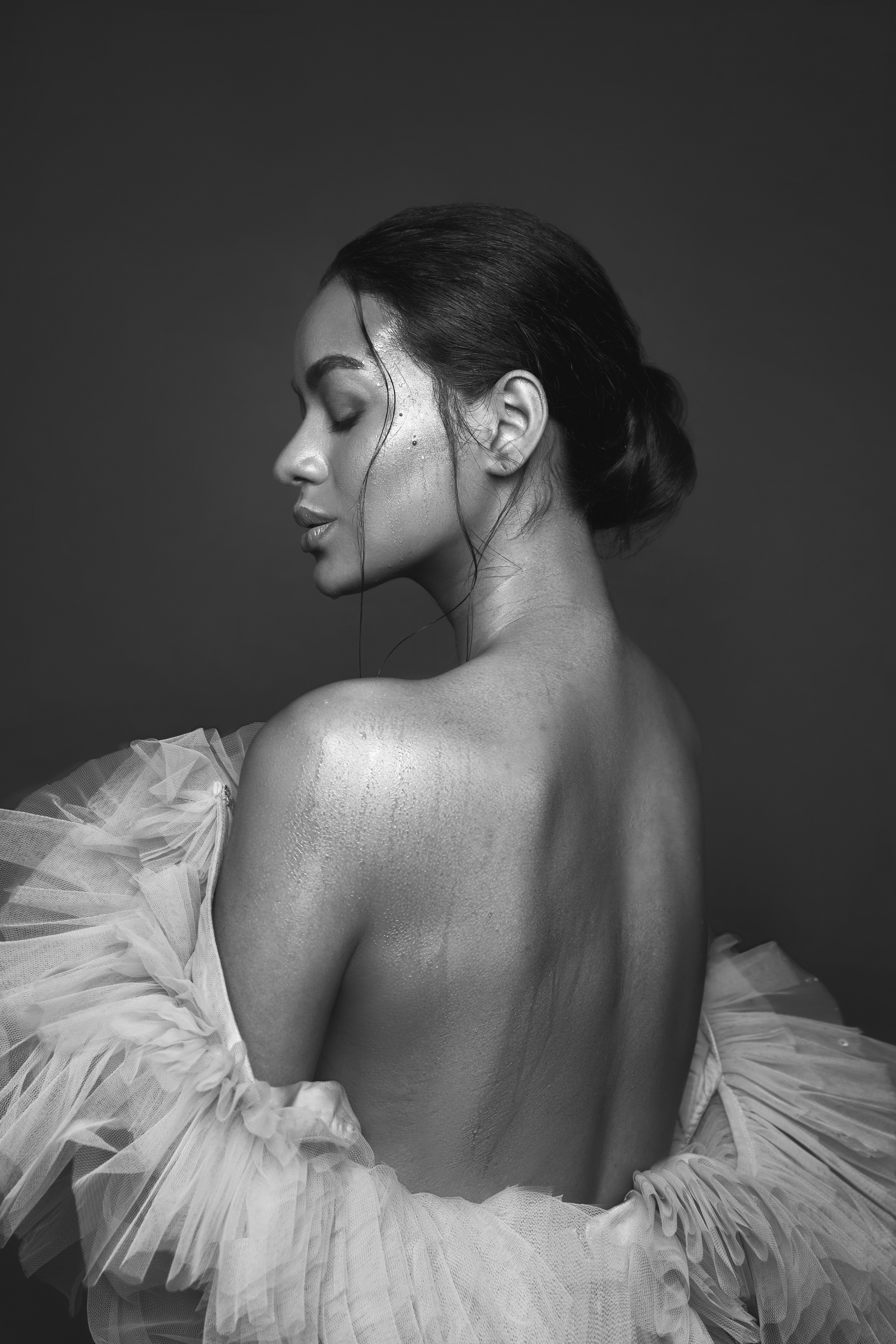
One of the first skills I would recommend developing ( and it is a skill that is in constant development, even for me)- is editing down. “Editing down” doesn’t have anything to do with Photoshop. It means looking at your image/portfolio etc and identifying what can be removed from it without affecting the overall idea. It is hard because as creators we grow fond of every element we add in the frame. But it is needed.
Little by little, you might just notice that your image feels stronger with less elements in it.
Now, here, I have to note, that there are artists who specialize on intentional excess in their imagery. But it does not take away from harmony and each element is serving the aesthetics. I will share some of such artists’ profiles- if you feel it is the style you love- try and study the principles they use when they add all those elements.
To recap:
1. Having “too much”, excess of elements or styling in your image can dilute the idea, distract from the subject.
2. Excess that is aesthetically pleasing needs to be learnt, developed and studied if you wish.
3. One of the crucial skills- “Editing down”- Having only the most necessary elements in your frame. Less is more
 Previous post
Sandcastles
 Next post
Getting published online

